Do you intend to follow all 10 tips that Smashing Magazine suggests? Why or why not? Also, make sure to explore the "40+ beautiful personal portfolio websites. Which sites are your favorite and why? What would you need to learn/know in order to make this type of portfolio?
I intend to try my best to follow the tips, but realistically my site will look very different from the portfolio sites exemplified. I enjoyed the sites that were simple, but dynamic, like Pedro Lamin's or Cartoblanc's. Alexandru Cohaniuc's page was also simple and to the point. The best layouts seemed to flow in some of the ways described in the tips above, but what was not mentioned was the limitation on colors and how emphasis and alignment can also benefit in making an effective web-portfolio.
In making web portfolios like this I would need an initial sketch-up of what was needed as far as elements go, figure out what needed to be coded and what needed to be graphics, what I can do with just HTML and CSS (no javascript, flash, etc) and go from there. I feel going over this site while collecting info to put on my own portfolio will help me remember how to write things such as the About section.
Labels
- Adobe Illustrator (7)
- brush pen (6)
- bunnies (1)
- Cellophane Rainbow (7)
- Ceramics (1)
- charms (2)
- Class Project (1)
- clay (2)
- College Hill Custom Threads (4)
- Digital (5)
- dragons (1)
- Drawing (5)
- DTC Course (7)
- gifts (3)
- Inspiration (1)
- Japan (11)
- jewelry (1)
- Miniatures (1)
- Other Artists (2)
- Review (2)
- School Writing (3)
- sculpey (1)
- Sketchbook (4)
- Sumi-e (7)
Installation Links
- Andy Warhol - silver clouds
- Anna Hamilton - color, light and space
- aural/visual art - cellophane
- Balloon Rainbow
- Christopher Lavery - Cloudscapes
- Dan Flavin's Work (light)
- Digital Cloud Building
- Fake wood rainbow
- Jim Hamlyn - Lightbox
- Kara Walker's Art - silhouettes
- Olafur Eliasson
- Puddle by Ryuji Nakamura
- Robert Irwin - Light and Space
- Sina Lightworks
- Tamar Frank - Light Installations
- Tara Donovan - common objects
About Me
Followers
Multimodal Literacy Narrative (by Scannell), 2)Digital Literacy Narrative (by Andfull), 3) Words, Magic (by Truaman), 4) Digital Litearcy Narrative (by Peyton), and 5)Literacy Narrative (by Wooten)
View the literacy narratives listed above and evaluate them (what do you like about them? what don't you like? why?). What criteria do you think we should use for evaluating these types of texts?
In the first one I liked the changes between the interviews, the stills, and the other clips, but the narrative didn't flow very well, and ran on about all her accomplishments. The introduction didn't really play in to being a thesis statement for the rest of the video, or any relevant introduction.
For the second, I felt the visual animation was interesting, but the graphics were poor, and the narrative was not formulated or spoken very well, and didn't seem to have a good point. Much like in the last narrative, I did enjoy the explanation of why the story was relevant to the author, but I think the childhood stories should be short.
In the third, the story was well told, and again the about the author (in this case the behind the scenes) was interesting. I do think the video could have benefited from transitions between his actual interview and some different visuals.
In the fourth, the fuzziness of the phone screen was incredibly frustrating, and took away from the story - the beginning and middle was too drawn out, but the conclusion was too short, and unfulfilling.
In the fifth, the point of the story was sort of lost on me, and the lack of background of the author made the narrative uninteresting. The transitions between different visuals, and how the story was told with text and stills was interesting and successful in my opinion, but the classical music was an odd choice for background noise.
I think what is important is to have a solid story within the narrative that flows well, interesting visuals, audio and movement, as well as something to 'take away' from it. If the narrative doesn't have a base to stand on, the majority of the content will not succeed.
.
The topic I plan to use for Project #2 is different approaches to creating webcomics out of everyday life stories. The three websites I have in mind are as follows:
Questionable Content (it's semi SFW, don't worry)
Girls with Slingshots
PHD Comics
Johnny Wander
Hyperbole and a Half
The key strategic differences I note thus far in my texts are style of layout and comic construction, base story line, basis of characters, and target audience. The similarities include genre, medium, general unintended audience, and sequence.
I think these similarities exist because they are all web comics based loosely off of the genre 'everyday life stories'. The differences vary depending on what the life stories are about. Pretty straight forward. Also I have a ton of homework to do, so I don't have much time to look at this right now.
IX Web Tutorials
Emphasis Response:
1. Describe where your attention is visually drawn in this text. What strategies does the author use to emphasize this element? Given that this text is essentially a title page for a larger project, does this emphasis seem effective to you? Why or why not?
My eyes is drawn to the pad of paper, and the hand writing with the pen, due to the movement and spatial arrangement. The contrast of the white paper to the rest of the slightly darker background also adds to the emphasis. This does not seem effective, simply because what is being written, the content, is not very large, and is difficult to see in this context. If the screen were larger and with more detail, on, say, a movie screen for example, this type of emphasis would work better.
2. Between composing the two different pages ("Digital Rights Management/Digital Robbing Maniacs" and "Criminal") the woman disappears from the screen and the jumpy stop-motion effect ceases. Describe how this moment of stillness can be understood as "emphasis" and explain if it seems like an effective strategy? What is emphasized by stopping the movement?
Because the stop in movement is a sudden change it gives the scene momentary contrast, and thus emphasis, from the other movement in the film.This is an effective strategy, but here it was used almost too briefly in my opinion. The emphasizing pause gives a chance to focus just on the words and not just on the writing movement and other elements.
3. Consider the role sound plays in emphasis. How does the soundtrack to this clip help to (a) emphasize certain moments in the clip, and (b) place a particular emotional emphasis on the meaning of the clip?
With the raising of volume and sharp percussion sound at certain parts it draws attention to the action that is in sync with its "beat", which is erratic, placing a feeling of tension on the text that otherwise might not be there, for example in this similar text.
Contrast Response:
1. Watch 0:22-0:36 of The JUMP's "Call for Papers." Notice the words, the gray box, the cartoon background, and the sound. Do you think any of these elements contrast? If so, which ones and how so (specifically, what makes them different from one another)? What effects do you think this use of contrast has on the audience and the purpose? Consider how the text's effectiveness might change if these elements did not contrast.
Yes, the movement is especially contrasting between elements: The font moves vertically in a flowing stream while the background animation moves horizontally in a stop-go pattern. I feel like the contrast in movement splits your attention, and would make it easier to pay attention to the message if everything were to flow together in a similar pattern of movement, but might not be as engaging.
2. Watch 0:55-1:08 of The JUMP's "Call for Papers." Notice how this is similar to the clip from question 1, yet the background no longer includes the cartoon. First, describe what elements are contrasting. Next, explain why you think the cartoon background was deleted from this section. What happens to the contrast now that the background is black? Which element is now the most emphasized, and how do you think this helps convey the purpose of the text?
The elements that contrast in this scene are the shades/colors of the text and the background - black and white. This section might not include the background because it is talking about the focus of what is required, drawing your attention to specifics, as if a reminder for an assignment for a class. The linguistic type is now most emphasized, along with the words, and helps solidify the idea in your mind as the sudden simplicity of the scene contrasts with the over-mixed media throughout the other scenes.
3. Imagine you've been asked to design a flyer to post around your campus advertising The JUMP. What would the flyer look like? Which element(s) would contrast and to what effect?
I would create a visual of the character jumping into a favorable job situation with this image and the words "The JUMP" emphasized, with explanatory text in a place where your eye is drawn to last. The text would have to have a form that contrasted with the image- so probably big black letters on a semi-transparent, grey-ish graphic.
Organization Analysis:
1. Choose 5 of the 15 images to drag into the empty timeline. Make a note about each of the 5 photos to explain what each one signifies, and how one leads to another. How does your organization convey your purpose?
1 2 3 4 5
1. signifies the starting of something new: a life, a phase, growing up, etc. leads to
2. the crowd scene, society, group that we eventually become a part of and live within (as if we went through a door of life)
3. Signifies that we are all the same yet so different, leading from the previous picture where the emphasis encompassed the entire area of the page, showing the similarities between humans while making a comment that we're all different. The barcode also resembles consumerism and
4. this slide signifies the process of getting place into or out of society, depending on if you consider the dairy to have been put out on the shelf or placed into the cooler.
5. Of course, this is a rough segway from the last photo - though the contrast from humans to products was supposed to signify 'dying' in a way. The graveyard signifies death, but in a mass gathering.
Ultimately, the pictures are supposed to draw together the story of life - how we come to be part of a society, and die with it, all as a repeating cycle of humankind. The similar elements from one photo to the next should signify the relations.
2. Are there different arguments that you could have made by organizing your 5 photos in different ways?
Yes, of course - If i had placed the opening door photo in front of the graveyard photo it might have implied death as the next great adventure, or as a disappointment of sorts when you knock on your last door of opportunity.
3. Are there other elements you could add to make your argument stronger—for example, playing music with the slide show or adding text?
I feel like music and text with this as a slideshow would make the communication clearer and the point more obvious - while pictures are wonderful because they are worth so many words, they are also hindering our ability to communicate because they give the reader too many options for interpretation.
Proximity Response:
1. Did you group certain categories of information together? How did you group them—typographically, by placing them closer together, or in some other way?
I grouped together title and sub-title, along with grouping them close to the image to add visual relation. The title was placed close to the subtitle, right above it, and slightly to the left.
2. What do you think is the most important piece of information on your cover? What choices did you make about typeface or size to convey that sense of importance? How does the layout of your book cover reflect your sense of how the information should be organized?
The most important piece, I thought was the title and sub-title, which I placed in the middle, slightly to the right, and next to the main visual element- the seagull. The typeface used for the title was large, and slightly bolder than the other lettering, though the author's name font was bolder. I feel like the layout brings emphasis both to the title and who the author is (the author's name is floating at the bottom half of the page alone). The layout reflects my belief that adding elements to the center-top of a page indicates I think of words at the top as the title of a book, while putting the author's name singularly, at the bottom, is how you label the writer.
3. What are some limitations you've encountered in laying out visual elements in a traditional way? What are some other ways you might want to organize the information on a book cover that might work better in a non-traditional format?
Because of the limitations in choices (size and selection) it was hard to design exactly what I thought was most appropriate for a traditional layout. Another way to organize the information more sequentially would involve moving elements, or interactive elements for optimal organization, which could not be done in a traditional format.
Alignment Response:
1. How would you describe alignment of the words "murmuring" and "insects" in the opening scene? How does the unusual alignment (reflected on screen and timed) add to your interpretation of the text?
The alignment is changing, but flows together next to each other to coincide into one idea. The soft dripping and oozing in and out in the alignment of the word murmur gives an acoustic word visual onomatopoetic qualities. The alignment of the letters inside insects as they appear in fragmented segments coming together to be the noun described by murmuring gives the word a relate-able personification of bug like gathering movement.
2. Now watch the "Earth" scene. What other elements are aligned in this
scene? How does the consistent alignment of elements across screens (and
also across some of the scenes) affect how you read these scenes? What
elements do you end up focusing on? Would the scene seem as effective if
all of the elements on the page (upside-down moon, contrails, words,
background color, etc.) had no shared alignment?
The words in this scene are more aligned with the moon, but are still on the same horizontal, and add a strong connectivity to the past scene. The moon is more in focus, and no the scene would not be as effective.
3. Now watch the "Air" scene, paying attention to the lines of poetry
and the audio tracks. The poem doesn't settle on the same horizontal
axis as the other scenes do, and the two phrases in the audio track are
aligned (synced) to appear with each line of poetry. Why do you think
the alignments of the words are different between the Earth and Air
scenes? What is the significance of the audio track's content in
relation to that difference?
The alignment is different to suggest that the earth is low, and the air high. The significance of the relation to that difference is to give a more visual, realistic feel to the recount of people jumping from the twin towers as they burned to the ground.
4. Now watch the "Water" scene. How does the curvature of the words,
aligning with the background image of an eye, relate to what the man in
the audio track is saying?
I can barely hear what he is saying, but I assume the alignment is to draw together the imagery, feeling, and sound of crying, because he mentions tears, and the words 'can never sing that song again' (or something). The elements bring together a grouping of interpretation of the message of tears.
5. Based on the alignment (or lack of alignment) between elements in a
scene and across scenes, why are the three menu options ("Air," "Earth,"
and "Water") on the main screen of this text not aligned? What does
this lack of alignment tell you about the emphasis, sequence, and
purpose of this text?
I feel like the elements are not aligned to give the moon and entrails more weight as visual elements, as well as separate the three out as elements across the page. The alignment implies emphasis on the feel of each individual elements (not all of them together), while adding weight to the idea of one scene happening after the other (destruction on the earth, the people jumping from the buildings, the people crying during and after), putting weight in subtle yet strong ways to the events at the world trade center on September 11th, 2001.
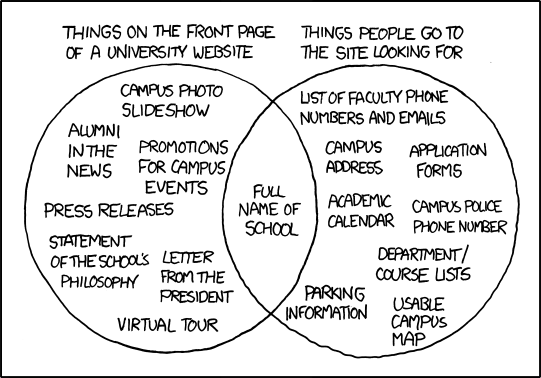
The XKCD comic is funny because it’s often true. First, look at the “things people go to the site looking for” list. Do you agree with this list? Why or why not? Second, visit a University website homepage and see if it follows the patterns listed in this comic. If so, why do you think this is the case? If not, what differences do you see and how do you think they matter when it comes to the purpose and audience for your University’s homepage?
Yes, I agree with the list, especially for our WSU homepage, because I always find it incredibly difficult to navigate from the main homepage to anything I'm looking for, even when going to mywsu. Reviewing my second community college's website I find that it is, for the most part, easier to navigate through, though the site provides an information overload, offering both new and current students all the links they'll need. The important difference is that Skagit's site actually provides the more important links right into their (tiny) navigation bar, though it still has too much bravado (in my opinion) than any website should have. For any audience, especially a fast-paced student, it's important to make it clean and simple, and make the navigation easy - like organizing folders on your computer, or putting clothes away in your closet - you don't just throw everything onto one pile, or in one folder. You organize it separately so that it's easier to find.
Many times it seems like the authors are all different, and don't work together on what is actually done for the website. Often times i believe this is a result of the commissioner and the designer; see the oatmeal for more ranting on that subject. However, since the recruiting students and managing current students seem to be such incredibly different purposes, I can kind of see how people have been having this issue for 15 years. Maybe. But really it might just boil down to communication problems, like many, many other problems in life.
Prompt: First, do you think there is a difference between the term "multimedia" and "multimodal"? Describe why or why not. Second, answer the "Response" questions from pages 3-7 of reading (note, there is one response per mode).
Multimodal seems to refer more to groups and how things are perceived as they work either together or not to convey a message, and multimedia is almost the same, but seemingly different in ways because 'mode' and 'media' have different meanings. It's like saying there are different mediums in art while within each medium different design elements are the underlying means (mode) for actual communication in the piece.
Linguistic Mode: Our thoughts and our prayers remain with the people of Japan. The President has
been kept fully briefed on developments and the response throughout the weekend.
As directed by the President, we have offered our Japanese friends whatever
assistance is needed as America will stand with Japan as they recover and rebuild.
What linguistic choices do you notice here? Are there any word choices or phrasings that
you feel are particularly effective?
The note that specifically directed by the President, "we" (as in everyone?) are to help however we can, 'standing by them' to recover and rebuild, suggesting we are there, but aren't going to barge in and fix everything for them, which would appeal to any resentful thoughts on past decisions to interfere with Japan's affairs.
Visual Mode: Look closely at the visual mode in the above Twitter profiles (figure 1.3 and 1.4). What
visual differences do you see between the two profiles? Do these differences shape your
understanding of the person behind the profile? What do you assume he/she is like? What
do you assume he/she uses Twitter for? Do you have a Twitter profile? What visual
template did you choose and why?
The colors and the profile pictures are the most visible differences. Each has a different feeling to the person, one is soft and cuddly (a cute panda for the picture and calm, baby blue colors throughout the background layout), The other a bit more adventurous with forest green and a cropped photo of the person writing. I'd assume that the first uses twitter, based soley on the visual, for posting fluff, or whatever comes to their mind, whereas the other I might think the same, but more involved in interesting topics. Or, maybe the first we could assume they post links to cute things, the other to more adventurous things like mountain biking or what not, but who knows without really looking - there is the saying of not judging a BOOK by it's cover, and essentially that's what 'text' makes.
Aurol Mode: Watch this short clip at http://ix.bedfordstmartins.com/color/analyze.htm. What aural modal
elements do you hear? What effect do these have on the tone of the piece? How would
the tone of the video change if a country or bluegrass song were playing in the
background?
There was music, the speaker, and a base track of tinkling bell sounds. The voice and music in the background are effective in communicating the point of how creativity fuels 'creative commons' but the drumming beat seemed to distract and overwhelm the other tracks. However, the tone of the video is calmer and more focused than if a bluegrass song were playing in the background - if that were the case you'd think they should be talking about a more rural subject and leave out all the digital/artsy aspects.
Spatial Mode: Visit the homepage for your University website. Notice how the spatial mode is used—
where is your eye drawn? How are the elements on the page laid out? What effect does
this spatial arrangement have on how you read, use, and understand the information?
How would it be different if, say, the information found in the center of the page were
suddenly swapped with the information at the bottom?
The graphics in the center are what draws the eye, and most of the elements are laid out around the central content. As we discussed in class, this affects the use of the website, throwing off students and making the site more a recruiting or educational tool than a resource for those currently enrolled. The site would have a whole different initial message and impression on those looking at it if the elements were rearranged - for instance the bottom as the center would create more of an impression to the viewer that the site was used more for information about the school, classes, etc than for anything else.
Gestural Mode: Visit www.whitehouse.gov, pull down the “Photos & Video” tab, and click on “Video”
(notice the red arrow in Figure 1.7). This will bring you to the most recent videotaped
speeches and events by the President. Choose one that interests you, and notice how the
President uses the gestural mode in order to support his points. Pay particular attention to
his hand gestures and facial expressions. Do you find his use of the gestural mode
effective? Why or why not?
The speech delivered was a brief on what's happening on Libya right now - mostly he goes from looking down and looking up at his paper to also touching the corners and turning the page, which is boring, but necessary for a speech. However, his seemingly uncaring, or disinterested attitude when delivering words on massacres comes across as cold, and does not help his image, or the delivery of the speech for any kind of impact.