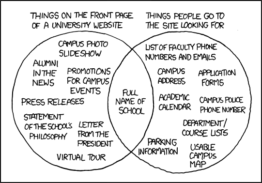
The XKCD comic is funny because it’s often true. First, look at the “things people go to the site looking for” list. Do you agree with this list? Why or why not? Second, visit a University website homepage and see if it follows the patterns listed in this comic. If so, why do you think this is the case? If not, what differences do you see and how do you think they matter when it comes to the purpose and audience for your University’s homepage?
Yes, I agree with the list, especially for our WSU homepage, because I always find it incredibly difficult to navigate from the main homepage to anything I'm looking for, even when going to mywsu. Reviewing my second community college's website I find that it is, for the most part, easier to navigate through, though the site provides an information overload, offering both new and current students all the links they'll need. The important difference is that Skagit's site actually provides the more important links right into their (tiny) navigation bar, though it still has too much bravado (in my opinion) than any website should have. For any audience, especially a fast-paced student, it's important to make it clean and simple, and make the navigation easy - like organizing folders on your computer, or putting clothes away in your closet - you don't just throw everything onto one pile, or in one folder. You organize it separately so that it's easier to find.
Many times it seems like the authors are all different, and don't work together on what is actually done for the website. Often times i believe this is a result of the commissioner and the designer; see the oatmeal for more ranting on that subject. However, since the recruiting students and managing current students seem to be such incredibly different purposes, I can kind of see how people have been having this issue for 15 years. Maybe. But really it might just boil down to communication problems, like many, many other problems in life.
Labels
- Adobe Illustrator (7)
- brush pen (6)
- bunnies (1)
- Cellophane Rainbow (7)
- Ceramics (1)
- charms (2)
- Class Project (1)
- clay (2)
- College Hill Custom Threads (4)
- Digital (5)
- dragons (1)
- Drawing (5)
- DTC Course (7)
- gifts (3)
- Inspiration (1)
- Japan (11)
- jewelry (1)
- Miniatures (1)
- Other Artists (2)
- Review (2)
- School Writing (3)
- sculpey (1)
- Sketchbook (4)
- Sumi-e (7)
Installation Links
- Andy Warhol - silver clouds
- Anna Hamilton - color, light and space
- aural/visual art - cellophane
- Balloon Rainbow
- Christopher Lavery - Cloudscapes
- Dan Flavin's Work (light)
- Digital Cloud Building
- Fake wood rainbow
- Jim Hamlyn - Lightbox
- Kara Walker's Art - silhouettes
- Olafur Eliasson
- Puddle by Ryuji Nakamura
- Robert Irwin - Light and Space
- Sina Lightworks
- Tamar Frank - Light Installations
- Tara Donovan - common objects
About Me
Followers
Prompt: First, do you think there is a difference between the term "multimedia" and "multimodal"? Describe why or why not. Second, answer the "Response" questions from pages 3-7 of reading (note, there is one response per mode).
Multimodal seems to refer more to groups and how things are perceived as they work either together or not to convey a message, and multimedia is almost the same, but seemingly different in ways because 'mode' and 'media' have different meanings. It's like saying there are different mediums in art while within each medium different design elements are the underlying means (mode) for actual communication in the piece.
Linguistic Mode: Our thoughts and our prayers remain with the people of Japan. The President has
been kept fully briefed on developments and the response throughout the weekend.
As directed by the President, we have offered our Japanese friends whatever
assistance is needed as America will stand with Japan as they recover and rebuild.
What linguistic choices do you notice here? Are there any word choices or phrasings that
you feel are particularly effective?
The note that specifically directed by the President, "we" (as in everyone?) are to help however we can, 'standing by them' to recover and rebuild, suggesting we are there, but aren't going to barge in and fix everything for them, which would appeal to any resentful thoughts on past decisions to interfere with Japan's affairs.
Visual Mode: Look closely at the visual mode in the above Twitter profiles (figure 1.3 and 1.4). What
visual differences do you see between the two profiles? Do these differences shape your
understanding of the person behind the profile? What do you assume he/she is like? What
do you assume he/she uses Twitter for? Do you have a Twitter profile? What visual
template did you choose and why?
The colors and the profile pictures are the most visible differences. Each has a different feeling to the person, one is soft and cuddly (a cute panda for the picture and calm, baby blue colors throughout the background layout), The other a bit more adventurous with forest green and a cropped photo of the person writing. I'd assume that the first uses twitter, based soley on the visual, for posting fluff, or whatever comes to their mind, whereas the other I might think the same, but more involved in interesting topics. Or, maybe the first we could assume they post links to cute things, the other to more adventurous things like mountain biking or what not, but who knows without really looking - there is the saying of not judging a BOOK by it's cover, and essentially that's what 'text' makes.
Aurol Mode: Watch this short clip at http://ix.bedfordstmartins.com/color/analyze.htm. What aural modal
elements do you hear? What effect do these have on the tone of the piece? How would
the tone of the video change if a country or bluegrass song were playing in the
background?
There was music, the speaker, and a base track of tinkling bell sounds. The voice and music in the background are effective in communicating the point of how creativity fuels 'creative commons' but the drumming beat seemed to distract and overwhelm the other tracks. However, the tone of the video is calmer and more focused than if a bluegrass song were playing in the background - if that were the case you'd think they should be talking about a more rural subject and leave out all the digital/artsy aspects.
Spatial Mode: Visit the homepage for your University website. Notice how the spatial mode is used—
where is your eye drawn? How are the elements on the page laid out? What effect does
this spatial arrangement have on how you read, use, and understand the information?
How would it be different if, say, the information found in the center of the page were
suddenly swapped with the information at the bottom?
The graphics in the center are what draws the eye, and most of the elements are laid out around the central content. As we discussed in class, this affects the use of the website, throwing off students and making the site more a recruiting or educational tool than a resource for those currently enrolled. The site would have a whole different initial message and impression on those looking at it if the elements were rearranged - for instance the bottom as the center would create more of an impression to the viewer that the site was used more for information about the school, classes, etc than for anything else.
Gestural Mode: Visit www.whitehouse.gov, pull down the “Photos & Video” tab, and click on “Video”
(notice the red arrow in Figure 1.7). This will bring you to the most recent videotaped
speeches and events by the President. Choose one that interests you, and notice how the
President uses the gestural mode in order to support his points. Pay particular attention to
his hand gestures and facial expressions. Do you find his use of the gestural mode
effective? Why or why not?
The speech delivered was a brief on what's happening on Libya right now - mostly he goes from looking down and looking up at his paper to also touching the corners and turning the page, which is boring, but necessary for a speech. However, his seemingly uncaring, or disinterested attitude when delivering words on massacres comes across as cold, and does not help his image, or the delivery of the speech for any kind of impact.